
Electoral College 2012 Including States Where the Candidates are Statistically Tied
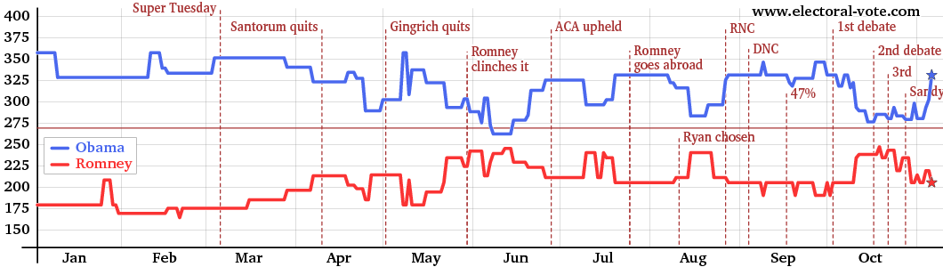
The graph above shows the electoral vote score for every day, counting, say, 46% to 45% as a win for the candidate with 46%, even though this is really a statistical tie. The gray vertical lines show the boundaries between the months.
Electoral College 2012 Excluding States Where the Candidates are Statistically Tied
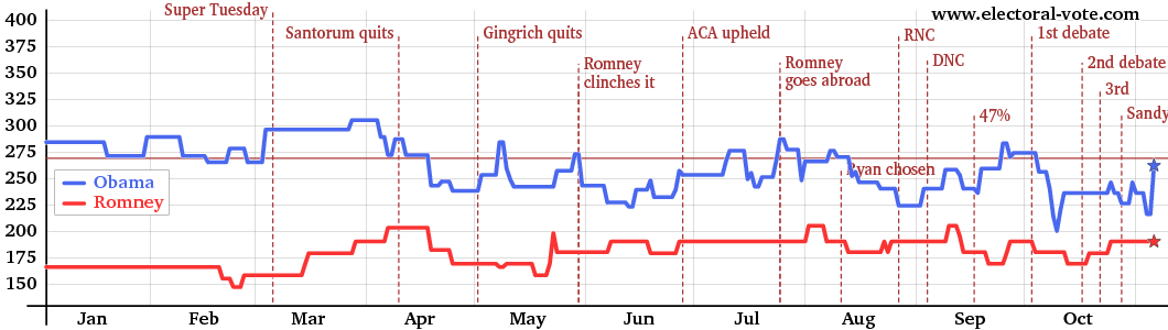
The graph above shows the electoral votes again but omits the "barely" states. The electoral votes of a state only count in this graph if the candidate is ahead by more than the margin of error (about 5%). In other words, the states with white centers on the map, which are statistical ties, are omitted in the above graph.
Electoral College 2008 Including States Where the Candidates are Statistically Tied
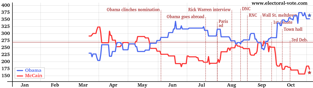
The graph above shows the electoral vote score for every day, counting, say, 46% to 45% as a win for the candidate with 46%, even though this is really a statistical tie. The gray vertical lines show the boundaries between the months.
Electoral College 2008 Excluding States Where the Candidates are Statistically Tied
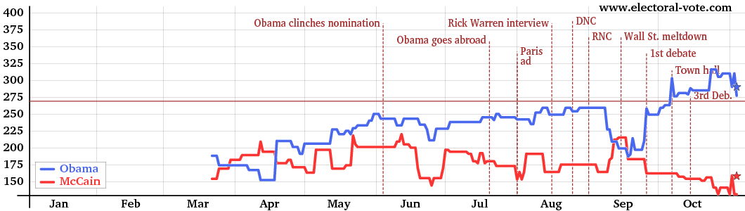
The graph above shows the electoral votes again but omits the "barely" states. The electoral votes of a state only count in this graph if the candidate is ahead by more than the margin of error (about 5%). In other words, the states with white centers on the map, which are statistical ties, are omitted in the above graph.
Electoral College 2004 Including States Where the Candidates are Statistically Tied
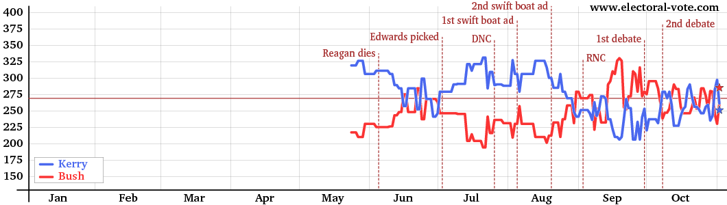
The graph above shows the electoral vote score for every day, counting, say, 46% to 45% as a win for the candidate with 46%, even though this is really a statistical tie. The gray vertical lines show the boundaries between the months.
Electoral College 2004 Excluding States Where the Candidates are Statistically Tied
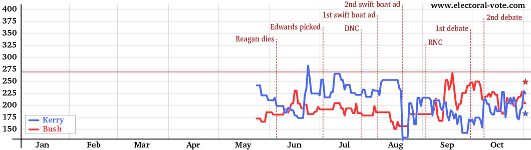
The graph above shows the electoral votes again but omits the "barely" states. The electoral votes of a state only count in this graph if the candidate is ahead by more than the margin of error (about 5%). In other words, the states with white centers on the map, which are statistical ties, are omitted in the above graph.