Dem
51


GOP
49


We've been holding onto this for a few weeks, and today's a good day to move forward with it, especially since some of these folks presumably won't be candidates for much longer. Jonathan Last, over at the Bulwark, is passionate not only about politics but also about graphic design. So, he ranked and assessed all the Republican presidential candidates—not on their platforms, but on how effective their logos are. Here are his comments, followed by ours:
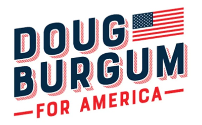
| Last: #1 Doug Burgum. The candidate may not be great, but his logo is the winner. It is upwards to the
right, always a good direction. Red, white, and blue and a nice 3-D effect. It jumps off the page. Very well done.
Us: We agree with Last that this is the pick of the litter. |
|

| Last: #2 Donald Trump. Last has absolutely no interest whatsoever in Trump the candidate, but Trump the logo shines.
Unlike the candidate, it is strong and bold and exudes power.
Us: Clearly, the Trump logo connects with people. We don't entirely get the five stars, however. Is Trump granting himself the rank of General of the Armies? Why not seven stars, so he even outranks George Washington? Alternatively, maybe the auto insurer The General is sponsoring the Trump campaign. Their mascot has also granted himself five-star rank. |
|

| Last: #3 Mike Pence. Did Karen Pence knit this one herself? It has a feel similar to Reagan/Bush '84.
The whimsical leg of the letter "k" is a nice touch as well as the letters touching, except for the "n".
Us: Last rated this one too highly, in our view. The kerning (spacing between letters) is so tight as to be distracting. It's like the third "e" didn't quite fit, so the graphic designer had to squeeze everything to get it in. |
|
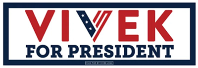
| Last: #4 Vivek Ramaswamy. The stylized "V" in the middle is nice, but the rest, not so much. The weak curvy serifs on "For president"
don't rock at all.
Us: Last is not a historian, and so presumably didn't recognize that Ramaswamy is referencing the stylized Vs used as shorthand for "victory" in many World War I and II recruitment posters. We think that's tacky, and we also, in contrast to Last, think it is ugly. |
|

| Last: #5 Chris Christie. This one is different. It has a slogan on it and says what his campaign is about. He will tell the truth.
Will that get him to 1.1% though? But why is "MATTERS" in red? Is that the key word here? Why not "TRUTH"? Isn't that what matters?
Us: Last is right that "Truth" should be in red, not "Matters." Maybe Christie's team was worried that would seem to be an inadvertent endorsement of Truth Social? Also, why is there so much space between the "S" and the "T" in Christie? It doesn't look like "Christie" it looks like "Chris Tie," like he's selling a line of signature neckwear. |
|
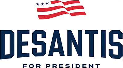
| Last: #6 Ron DeSantis. What's the bit here? He put his name in a college block font and bowed it out a bit to give it
some movement. And that flag with three stars and three red stripes? What's that supposed to prove? That most of the country
doesn't count? It is untethered to the logo or the brand.
Us: If Rocky Balboa was running for president, this is the font he would use. And indeed, that flag is a disaster. |
|

| Last: #7 Nikki Haley. By putting "NIKKI" in blue and "HALEY" in red, the eye flows left to right. The font is
weird though. Look at that "A." It looks like it came from Battlestar Galactica.
Us: Last doesn't name any fonts; we're not sure if he can't identify them on sight, or if he just thinks that's obnoxious. All we can say is that it's rather apropos that a robotic candidate like Haley is using the font Roboto, albeit with that customized "A." That font was bestowed upon the world by Google/Alphabet, so keep that in mind if Haley rails tonight about biased left-wing social media companies. |
|

| Last: #8. Tim Scott. Even with Larry Ellison's billions Scott couldn't get someone to design a decent logo for him.
The designer should be murdered. It makes your eyes bleed. The bright color here is with "TIM," not "SCOTT." Completely backwards.
What's the stupid rectangle for? Why doesn't the middle part of the "M" go to the baseline? What's the point of that? And what
does "FAITH IN AMERICA" have to do with Scott? All in all, a huge loser.
Us: Short first names are tough, which is why Ron DeSantis didn't include his (also see below). And obviously, Scott's designer did not solve this problem. If we were advising the Senator, we'd tell him to ignore his generic last name, and build his logo and his campaign around "Tim." Hey, it worked for Ike. |
|
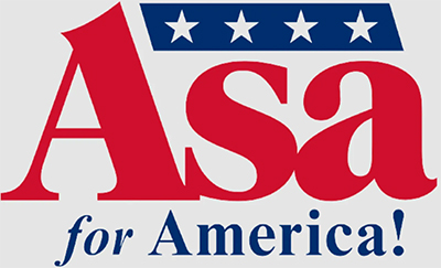
| Last: #9 Asa Hutchinson. Dear God. What has he done? The logo is a wreck. "Asa" is in a
complicated font and the way the "A" interacts with the"s" is dreadful. What's the exclamation point for? To remind people of Jeb!? Is that his role
model? The slope of the blue parallelogram is the wrong way. It should be uplifting, not downlifting. And only four stars? Was it otherwise OK
but room service took too long? And why in heaven's name is "for" in italics. Is that special? Nothing makes any sense. Is ChatGPT getting
into the logo business but it isn't debugged yet? Hutch deserves better.
Us: Last hits on all the things we would have hit on. Hutchinson only promoted himself to full general; a real president isn't satisfied with such a piddling rank. "Asa" is a palindrome; that presents opportunities that were not explored. |
|

| Last: Will Hurd. Not ranked; Last didn't include this one.
Us: We get it, he's a Republican, and red is the color of that party, so the "R" had to be red. And he's from Texas, so he had to get a Lone Star in there. But trying to do all those things at once makes the "R" too much. Also, the star looks off-center (even if it isn't). |
|
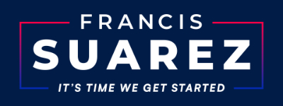
| Last: Francis Suarez. Not ranked; Last didn't include this one.
Us: You can tell Suarez is not ready for the big time. There's the silly, meaningless slogan, but that's a messaging issue. From a graphic design perspective, the giveaway is that blue-red gradient line that forms a box around his name. When bumper stickers, t-shirts, etc. are mass produced, they don't use CMYK, as is done with newspapers, magazines, books, etc. They use spot colors (e.g., a red plate, a blue plate, a black plate, etc.). That kind of gradient is really hard to achieve in that manner, and if the plates don't line up perfectly (and they often don't), the gradient looks awful. |
|
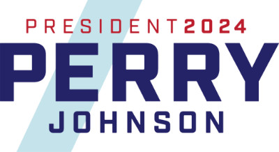
| Last: Perry Johnson. Not ranked; Last didn't include this one.
Us: We're not so sure what the slash is about. Johnson sometimes talks about "slashing" the national debt; if that's what he's going for, wow, that's a stretch. And because of the slash, and the way it leads the eye around, we keep reading that top line as "Presidente 2024," like he's running for office in Central America. |
|

| Last: Larry Elder. Not ranked; Last didn't include this one.
Us: We think this one is actually top three among all the logos on the page. That said, while Elder was going for a shooting star, we see a falling star. Make a wish. |
Graphic design is hard. But still, it's not out of bounds to note that if a candidate can't get this important part of their campaign right, it's not a great sign. (V & Z)