
Introduction
Every day the partisan composition of the 114th Senate is predicted from the state polls. Here are the results. The upper graph includes all states. The lower graph includes only those states where one candidate has a lead of 5% or more (roughly the margin of error for state polls). Blue is for Democrats, red is for Republicans.
Senate Including States Where the Candidates are Statistically Tied
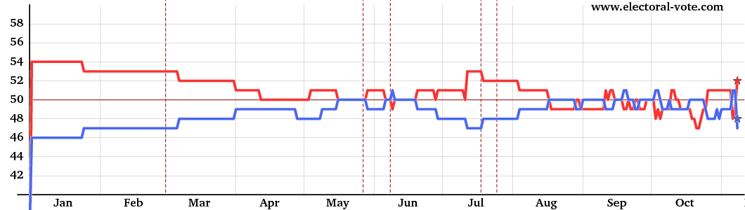
The graph above shows the Senate score for every day, counting, say, 46% to 45% as a win for the candidate with 46%, even though this is really a statistical tie. The gray vertical lines show the boundaries between the months.
Senate Excluding States Where the Candidates are Statistically Tied
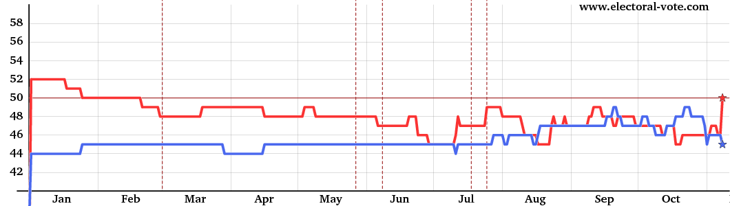
The graph above shows the Senate again but omits the "barely" states. The senate races only count in this graph if the candidate is ahead by 5% or more (roughly the margin of error). In other words, the states with white centers on the map, which are statistical ties, are omitted in the above graph.